 To begin with, I will look at a pattern-based photographer named Andy Goldsworthy, who I also studied and wrote about in my secondary school three-dimensional design course. Goldsworthy specialises in landscape photography in which he creates patterns out of the natural resources in the nearby environment, i.e. sticks and pebbles in a forest or stones on the beach.
Many of his pieces appear as rings that lead the eye inward to the centre of the image, typically into a void of sorts, as seen in this image. Oftentimes, Goldsworthy will also use darker colours on the outside of the ring, and then lighter colours as it shrinks inward, until it's pitch black again. This is not the only theme he does, as he also creates spirals out of stones that spread out wider as the spiral expands, and rings of colourful leaves upon the surface of the water, and so on.
His work will help influence this project as it features elements of great composition, both how the piece is photographed, and the colour coordination within the image, i.e. here, the dark red to yellow gradient shrinking inward, before eventually turning to pitch black, creating higher contrast in the centre of the image than anywhere else, drawing the eye inward to the focal point, as intended.
Carrying my research into paper-based artists, I'm now looking at Owen Gildersleeve who specialises in paper cutouts in various colours, i.e. in this piece, which is exclusively a gamut of blues, ranging from white down to dark navy blue. They often feature unique patterns and shapes, i.e. rings shrinking inward, either wavy as in this piece or octagons as in another piece which is pink and features a person walking down through the piece, large enough to be a hallway.
Gildersleeve has worked with people/companies such as Ben & Jerry's, Fanta, James Day and even LGBT+ organisations such as Pride in London, for which he created a piece featuring a large rainbow heart against a magenta background surrounded by women, with the text "LEZ WE CAN!" in front of the heart, making this representation for lesbians in the LGBT+ community.
This helps tie into my work in graphic design and will also influence my themes and use of colour. On top of that, I will be reconsidering composition and layering within my work, as I now see I will be able to use several sheets of paper—or more likely card for the sake of stability—and some lighting tricks to create well-defined layers.
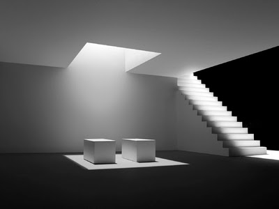
Finally, I will be looking at the work of white paper artist Stephen Lenthall, famous for pieces such as the example here. With black external backgrounds,—almost like voids, as though the environments are tumbling around in the fabric of nothingness—white paper—or perhaps card—walls and decorations, and harsh lighting, Lenthall's work is exactly what I aimed to achieve in my second post, Officium Parabolam.
In this piece, two boxes, assumed to be display tables, are placed in the centre of a large room with a staircase on the right-hand side leading to the rooftop, stretching past the back wall, with no wall to the right-hand side of that, leaving it as an open, dark chasm. A square cutout in the ceiling above the boxes is emitting a bright light down below, which is also seen on the staircase, albeit softer as the light was presumably cast especially for the ceiling cutout, and is leaking out onto the other open spaces.
Lenthall's work will help to influence mine as I will have a clearer vision of what I am attempting to create and will guide me in the process of creating them, i.e. considering what I am to make, how I am to lay it out, how complex / simple I am to go, how abstract I am to take this, how I am to light it with the equipment at my disposal, and an overall test of my creative abilities.
With attempts at creating a blend of these three artists' work altogether, I may be able to find a perfect middle ground for a perfect mixture of unique art styles. I am aiming to achieve something similar to Lenthall's style although with a very apparent addition of Goldsworthy and Gildersleeve.


No comments:
Post a Comment
Note: only a member of this blog may post a comment.