Surreal Project Planning


Going into my second year at college, my photography work will become more independent and I will finally have more control and more of a personal touch over my work like I have always dreamt of.

 For my new project, I will be creating mixed media pieces via the use of photographic elements, graphic elements, varied, deep and methodically-approached research, and a range of programs and techniques, i.e. photo-manipulative-friendly programs such as Photoshop and, in some aspects, PaintNET, and more personally graphic design-specialized programs such as the aforementioned PaintNET and FireAlpaca.

 Lots of planning and documentation of progress is recommended for these projects, which I am thankfully already fairly consistent with when it comes to my personal projects. I also find it easy to document and record progress along a project; exhibiting the journey to the lynchpin of a particular project is a skill I am thankful to possess.

 As documented below, I have conducted a mind-map of ideas. Albeit small, there are several routes I can take that are very resourceful and rich. The route I feel most comfortable taking is the mixed media path, with elements of photo-manipulation and other artists' styles to vary my work.

 Dissimilar to my recreations, I will be able to showcase my own personal work fully and freely with optional elements of other artists' styles, which I am happy to take on board. Two artists in particular I may attempt to incorporate into this project are Dela Deso and Tyler Spangler, both of which I studied and researched in my secondary school photography GCSE course.


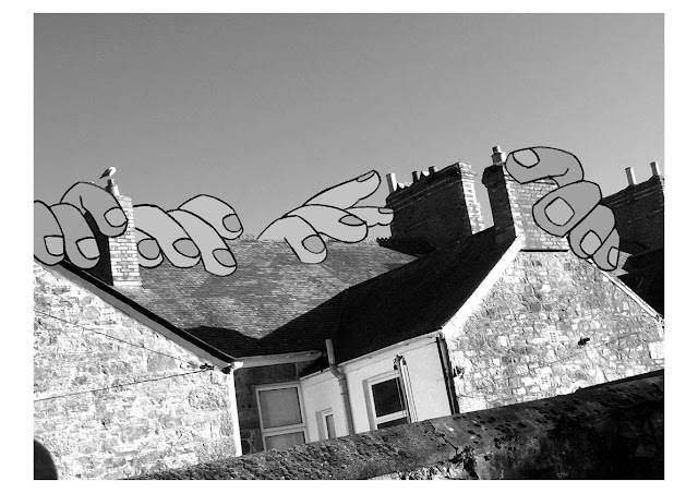
 I have also been advised to, in tandem with my photo-manipulation and graphic design mixed media planning, look into surrealism. Creating brand new landscapes—essentially camera-less photography, exclusively on Photoshop—out of various other photographs and resources is an avenue I have not previously explored but would vary my work incredibly, and is an idea I will be taking up due to the pragmatic and metaphysical messages and meanings behind it.

 My lecturer has created concise and helpful notes regarding my exploration into surrealist art and how to approach an essay writing about Salvador Dali, a surrealist painter best known for The Persistence of Memory, a painting of several melting pocket watches across a coastline.


 I hope to create a piece reflecting my dreams and nightmares, including visuals of my biggest fears, such as heights and insects, and odd occurrences within my dreams, such as the world flipped upside-down, or walking around purchasing items in a shop, such as sweets or stationery.

 I will use photographs I have taken, as well as reference images which I will photo-manipulate to create something new from them. I may also be able to incorporate other programs into this, such as PaintNET and FireAlpaca, art and graphics programs I have used for some time for personal work, and even some college work showcased here.

 By the end of the creation of my first piece, I hope I will have established the framework of a basic style and will be able to tweak and adjust it as I continue to ease myself into Photoshop and surrealist art in general. I will need to keep my ideas fairly grounded in my own ability, but will also need to step out of my comfort zone to achieve variety.

Final Piece (+ Pinterest Board)


The process for creating my final piece was relatively simple. As I did before with my Goldsworthy recreation, I took a piece of paper and—with my new printer ink—selected twenty-four pieces of my art, ranging from August of last year to April of this year, created a contact sheet, printed it out, cut out each of the pieces and laid them out in a ring on top of a sheet of paper. I then took another sheet of paper and folded it in half to place in the background, acting as two walls and a corner where the floor and two walls meet at the bottom.


 After photographing this, with an orange lamp glow in the background and my phone's camera's flash feature, I imported it into Photoshop, adjusted the exposure, offset, brightness and contrast, then saved it, imported that into FireAlpaca, and created layers on which I drew using colours from a Pantone Solid Coated guide PDF file. I opted for the pink layers to remain lineless and without any median filtering through PaintNET to smooth them out.


 Above is the actual final piece. As for the pit in the middle of the image, I drew a line to distinguish the exposed area of the paper 'floor' below and the white edges of the printed images themselves. I then rounded the corners inside—and one outside—of the lineart, as is my 'signature' with any piece with lineart. The printed images themselves, viewed up closer, have a very strange printing error in which the printer has not properly aligned, so especially with lineart, colours are displaced, making for a 'glitch' effect, which I personally believe enhances the image and its zany vibes.


 I also did not forget about my other Pinterest board! I started this before I began my Gildersleeve recreation but was too caught up amid my inspiration to create to have posted it here. I also felt it would have been redundant to limit it to its own singular post as there would not have been a lot to say about it on its own without the contextual assistance of the other images here. The common colour theme of this board is blue and purple, with the occasional red, yellow or green. I decided to stick to the harmonious purple and pink range, as is also my favoured range of colours in art, when creating both a recreation of Gildersleeve's work and a mini-recreation in a combination of three different artists.

 My wording is not so good; it eventually turns into mindless rambling.


 Finally, here is the sketch I had produced when planning out this final piece. I had originally planned for Gildersleeve's section to be a doorway with its own frame, varying in colours, but had opted for a simpler route, and went for a wall leading outward, appearing as a turn to the left-hand side leading behind the viewer's point of view, and almost up a case of stairs, too. One major mistake I made in producing the final piece was in the Gildersleeve aspect.

 Due to PaintNET not being involved in the creation, I had not created drop shadows underneath each layer. This is also due to the darker shades being drawn on top of filled in lighter shades, meaning there was no sections empty for the darker shades to go underneath. This is mainly due to me having done this at an uninspired and inopportune time, a.k.a in the morning after having overslept and still in pyjamas. Otherwise, I am fairly happy with this final piece and am excited as to whatever my next project will be.

Mentis Imperium, et Lunam, et Pastor

  The final stretch of my surreal photography project was not as ambitious as I had hoped, but on the brighter side I got to convey a differ...