Going
into my second year at college, I have decided to attempt to create—or recreate—surreal artwork via the use of various art programs, such as Photoshop, PaintNET and
FireAlpaca. I will be able to use both FireAlpaca and, to a much greater extent due to plugins, PaintNET at home. Currently, I will be producing preliminary sketches of my ideas of what I plan to create. This is all subject to change.
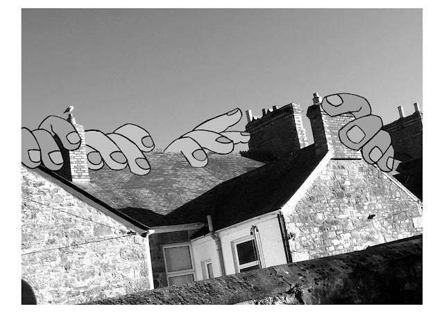
First, we have “Lightheaded”, created by self-taught hobbyist Christophe Kiciak. Depicted here is a woman
with a detached head on what looks to be a leash, akin to a balloon on a
string, riding a bicycle along a dirt path. On either side of the path appears
to be fields of flowers, and ahead of the path among the warped hills appear to
be large hands preparing to grab onto something. There is also a light ahead of the
pathway in-between the hands, and a full moon in the top left-hand corner, despite a
stormy dusk-esque sky.
This image may represent birth or death, i.e.
the light at the end and the hands either side, either representing a doctor’s
hands reaching for a baby, or the hands of a godly figure reaching for the
spirit of a dead person to bring them into heaven. These are just my
interpretations and are far fetched, so both of these are unlikely. As the
title is “Lightheaded”, I’m lead to believe this is a derealisation-based
episode or hallucinations as a result of, for example, decreased blood volume around the brain or
use of various forms of hallucinogenic substances.
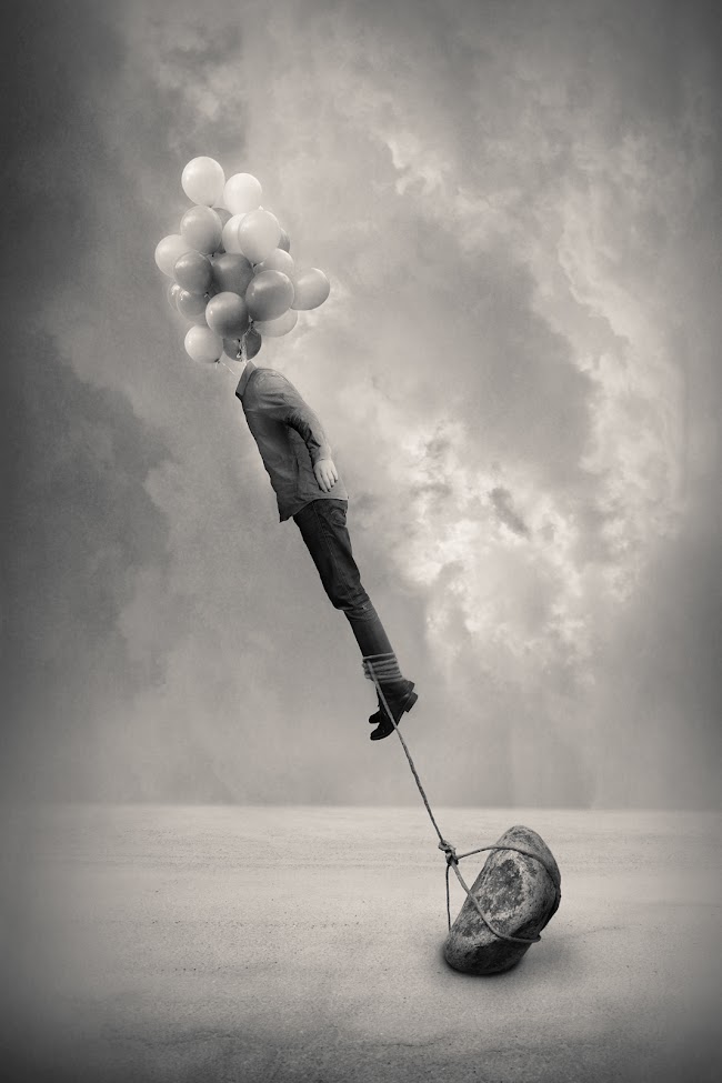
My second chosen piece is a more modern approach to surrealism with more blatant symbolism by connecting the objects that give meaning, i.e. in this piece, the rock being the bad, the balloons being the good, and the man being a conduit to represent humanity when given choices with restrictions or limitations. By having the rock tied via rope to the man's ankles, it is apparent this is to weigh him down, as it carries a resemblance to concrete shoes used to anchor someone, albeit in this case, it is not for the sake of physical murder, but perhaps psychological murder.
I previously analysed and recreated Ingberg's work in my secondary school photography course; my chosen piece featured a man's head in the typical Ingberg-esque attire—a suit and bowler hat—with his face removed, appearing shattered like a broken window, and revealing a brick wall behind it, perhaps as a nod to the adage of talking to a brick wall. This new chosen piece could be the reverse of the idea of co-existence; one thing can happen without the other, whereas usually, ideas need to co-exist in order to function.

Returning
to the more Dali-esque side of surrealism—where it is not weird for the sake of
being weird, but rather having meaning and structure behind it, with symbolism
and pragmatic, thought-provoking visual elements—I have taken to a list of
surreal photographs with ‘unknown’ artists, with this piece catching my eye.
I wanted to find similar pieces after I had
discovered a piece identical to this one, with a pipe instead of an egg, so I
found this image on the list, saved it, reverse-image searched it and found it
again on Google Images with a link to a Pinterest page, which then linked to a
DeviantArt page, this thankfully being the actual artist’s page. The artist behind this piece is a Turkish DA-based woman named Aksam Gunesi, pseudonomically known as beyzayildirim77, and she creates tons of fascinating, obscure pieces, including variations—a
series—of pieces akin to this one, with various other objects / food items in place of the egg, i.e. an
apple or a roll of sushi.
If
I am to draw inspiration from this artist, it may be the majority of my surreal
pieces going into my second year, as this is essentially the ideal structure of
what I wish to produce; a very clear and concise piece with a less-is-more
feeling to it, akin to what Dali created.
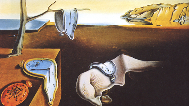
My fourth chosen piece is a classic, iconic for its iconography, and renowned for its influence in art as a whole and the theme of surrealism. Painted by Salvador Dali in 1931, this piece has shaped the art of surrealism and defined what it means to envision surreal scenarios as a whole. It's totally plausible, having a dream or vision of melting pocket-watches on the beach.
In order to recreate this, as with my plans for my Ingberg recreation, I will need to combine photographic elements with digitally drawn elements using various art programs such as FireAlpaca and PaintNET, both of which I use extensively at home. By combining the digital elements, I may be able to either add drawn elements that look more like stylised realism or to filter and tweak photographs to have them appear drawn.
For my fifth piece, I have chosen to look at the work of John Brosio who specialises in photo-manipulation / illustration of natural disasters, most commonly tornadoes and hurricanes, although some are accompanied with figures standing by looking on as if nothing was happening, and some are taking place in small towns.
Due to the photo-realistic nature of the images, albeit they either are painted, presumably with references, or either filtered, I will be applying a presumed similar process by taking photos, adding slight filters and effects for a touch of a traditional artwork feel and the occasional illustrative element to tidy things up.
As this piece features giant crows destroying a small town rather than it being the result or in-the-moment happening of a twister, I found it more amusing and, of course, easier to create. My idea for this is to photograph streets at a distance so there's plenty of ample room to put things in the environment, i.e. in the streets or skies as in this piece, and to photograph animals to put there. Since I have two cats and a dog, I will be able to use them as my 'models'.
It is worth noting at this point that my original final artist had to be changed due to the chosen piece being misleading—the photography I originally believed to be of Joan Miro's own work turned out to be a teacher's piece inspired by Miro. As much as I would have loved to carry on with this artist, he did not photograph his work. It may not have worked out either as it was not photography itself, but rather fine art, although the element of it being photographed would have lent some credence to my idea being acceptable within this project. I will continue to attempt research into a sixth artist, although I may have to branch out away from my chosen theme a bit as most modern surreal photography is too complex for my level of skill.
As of the start of October, the vision for my project has changed drastically, but in a good way which will allow me to progress properly and in a direction I am both comfortable and happy with, which also introduces an element I was hoping to include within this project, that being drawn elements. I can do this by drawing cartoony graphics over photographs which suits my personal style a lot better and makes my life easier. I've scrapped the previous artists in place of five new ones, two of which I studied in my secondary school photography GCSE course, so I have more experience to base my work on.
I've compiled two mood boards containing the works of Storm Thorgerson, Duane Michaels, Gregory Crewdson, Richie Valezquez—pseudonomically Dela Deso—and Tyler Spangler. I plan to add one more artist, as six is the requirement, and to dedicate a mood board on its own to their work to balance out the load. I have also drawn several plans plotting how I plan to go about these shoots.
My choices for each artist is simple; they all have vastly different and unique styles that are relatively easy to recreate, for which I will detail in a list below alongside my illustrated and annotated shoot plans.
Thorgerson's consist of abstract ideas such as objects in places they're not supposed to be, or portrait shots with the sky taking up the majority of the space, with barely any other elements at work.
Michaels' consist of black and white shots, either singular or a series, the latter I plan to recreate as they are his conduit to convey a surreal narrative, i.e. a room gradually filling with potted plants or a woman angling a handheld mirror to produce strange reflections.
Crewdson's consist of wide-angle shots, essentially panoramas, of still life in gloomy and moody environments, typically one figure among an otherwise empty 50s-style household, or in a cabin out in the snowy wilderness.
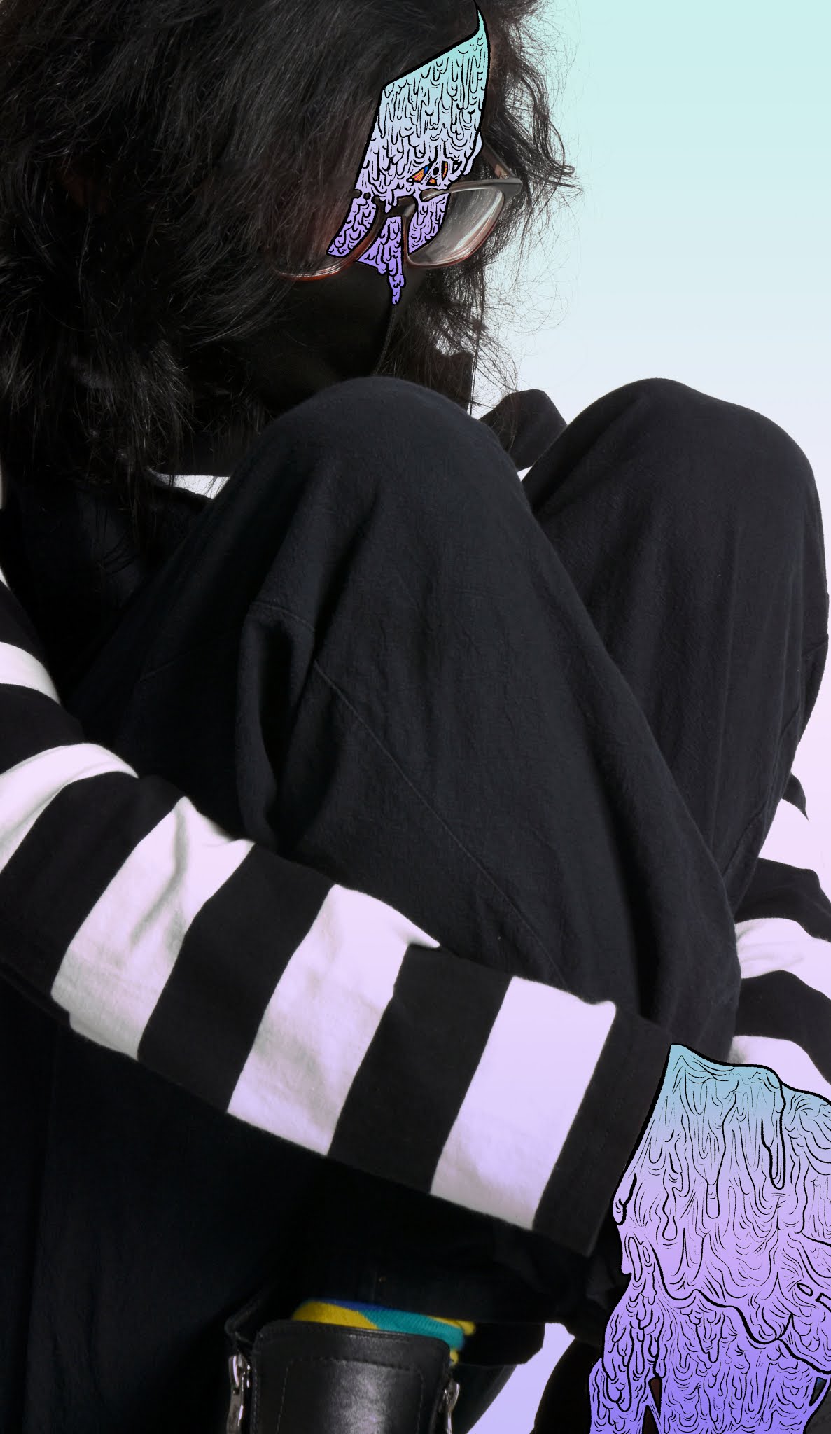
Valezquez's consist of photographs of models and famous figures with grimy graphics drawn on top, namely their skin or clothes, to make them appear slime or zombie-like. This is especially due to the melting skin beneath their white, vacant eyes. Bright, vivid colours often in gradients or in akin gamuts are splashed inside thick and highly-detailed lineart.
Spangler's consist of photographs of models and famous figures with cartoony graphics drawn on top, often hands or facial features, sometimes slime, akin to Valezquez. Bold and consistently-weighted lineart filled with few colours or gradients are what make Spangler's pieces iconic, that and his other work involving warping and distorting a face, either by making it appear as if it were melting or cutting it in half and having colourful shapes flying out.
All of these artists clearly have very well established styles that will all take different routes to recreate, whether it be setting up the shoot, how it is shot, how it is filtered, what mediums are used, et cetera. I plan to use a DSLR camera for my shoots and to take them around my house, i.e. my front and back garden, my bedroom, living room, and anywhere else if necessary. Taking it outside would not be a very viable option considering the drastic change in weather, as the wind and rain have picked up monumentally.
Since I have methods planned out for each artist, but have yet to choose my sixth, I will go with Corita Kent, as I am planning to study her work in my graphic design course. Since I can now create a traditional piece and photograph it like I was hoping to earlier, I will conduct a method. I will likely do this by using paper cutouts of letters and shapes, overlaying them over another piece of paper, colouring them in via the use of my alcohol markers and photographing them. I will take the sets of photos into Photoshop, adjust their values so they all look natural, and cut bits and pieces out and stick them together, applying various layer modes to create pieces in Kent's iconic style. This is likely how I will be doing it in my graphics course, too, so I have more experience and can easily apply my learning to either course.
My plan to recreate Kent's artwork is to cut out various letters and shapes, with large ones being cut with scissors and small ones being cut with a carving knife. That sheet used to cut them out will then be laid over another sheet, on which I will colour using either markers or paints, likely the latter due to less waste of materials, even if I don't use my markers. It will also take less time, have more texture and be closer to replicating Kent's style, and likely also turn out better in the photos. This is also akin to my work in secondary school photography, where I painted on a sheet of paper and photographed it for use in a series of photos.
Overall, I feel a lot more confident about this project and I am excited to start it.