Wrecked Room


Finally, for the three artist recreations, I've looked at Stephen Lenthall's work and have attempted to incorporate certain elements, such as stairs and decorations, i.e tables and stools. Whilst my ability is lacking, I have simply taken strips of paper and created folds on either length-wise edges to make them stand up. For the table to the right-hand side of the first image, which also appears in the middle of the space in the images below, I made one fold further toward the centre than the other as to create a slanted desk, much like that of an illustrator's / artist's back in the day.


 As a means of contrasting the tone of these images in terms of the scattered paper and furniture acting as a minimalist, almost dystopian, display, I've decided to keep the warm glow that these images irradiate when I took them. I had originally intended to take them into Photoshop and convert them into black-and-white before tinkering with the levels, exposure and offset, much like my Goldsworthy recreation, although I chose to keep it the exact same as when I first took it.


 For my final piece, I will be merging these three styles together in a way I will have to carefully plan; I will be making visual notes of my plan and will annotate them and post them onto a separate post before my final piece is created and uploaded here too. What I intend to create is a physical paper environment—Lenthall—with a partial element of torn paper in some pattern—Goldsworthy—and then adjusted in Photoshop, drawn over digitally in FireAlpaca and then finally adjusted again in PaintNET.

Ripped Ring


For my second artist recreation—originally intended to be my first—I have recreated the style of Andy Goldsworthy via the use of torn pieces of paper, varying in small and large sizes. To do this, I simply took one sheet of A4 paper and placed it on my desk, and took another and tore around the edges so no sharp edges were visible. At first, I started to tear large pieces of paper for the outskirts of the ring, and then I gradually went smaller and smaller as the paper got closer to fully torn up. I then placed them in rings, starting very small, and gradually expanding in size as I worked outward.

 I took the photograph using my phone camera and imported it into Photoshop. I then adjusted the levels, the exposure and the offset to accentuate the shadows, make the dark spots darker and the light spots lighter, namely the corners and centre respectively, to create an effect similar to Goldsworthy's work, with the brightness increasing toward the centre, with the darkest spots being the edges, albeit in grayscale rather than in full colour.

 For the third piece, the Stephen Lenthall recreation, I will take the same approach as I did with Officium Parabolam, in which I will construct simple environments and decorate them with paper props, such as pieces of paper and tables or chairs. I may also attempt to create stairs by folding a slim-cut piece of paper over in tiny increments backward and forward, unfolding it to create stairs, which I will hold up over the edge of the paper walls.

Scarlet Galaxy


 My next photography project is going to be handled slightly differently, and slightly the same simultaneously. I will be producing four different images with styles similar to the artists I have researched as per my previous post. Three of which will be recreations of their particular styles, and the final will be an attempt at merging the three together.

 Although my first chosen artist was Andy Goldsworthy, I decided to get Owen Gildersleeve out of the way due to his style being easily recreate-able in digital format, although I originally wanted to save him for later for the sake of delayed gratification—I knew that it would be fun and pleasant to recreate his style digitally, and so I simply could not wait, and jumped straight into it.

 For my next piece, I will attempt to recreate Andy Goldsworthy by collecting various pattern-friendly materials at my disposal and creating some formation out of them, i.e. leaves or petals. After Andy, I will go after Stephen Lenthall, as his creations are strikingly similar to what I had created, almost exactly what I had envisioned wanting to make out of what I had at my disposal.

 I intend to clear out a space for me to work comfortably and carefully, in which I will have paper, card, pens and various light sources at my disposal in order to create something similar to Lenthall's work. Due to all of my lights being yellow and orange, I will have to play around with Photoshop to make the lighting more faithful to Lenthall's style. I may also use this workspace for my Goldsworthy recreations.

 To create this piece, I used two art programs: FireAlpaca (x64), and PaintNet, both of which I have been using for most of my digital art hobbyist life. I have used both programs together in the past in order to create various pieces of art, including YouTube thumbnails and posters. FireAlpaca acts as a standard art program; various brushes, free choice of colour, easy and intuitive, et cetera. PaintNet acts more as a Photoshop alternative, built for zeroing in on details and subtle correction with various tools and filters, i.e. arrow key movement, layer types, plugins, effects, adjustments, et. cetera, although it does not feature various types of brushes.

 Although it is being adjusted to better suit direct illustration, I would not personally recommend it for such at this moment. Art-specific programs that I would recommend would be PaintSAI, Clip Studio Paint and Krita. Another alternative to Photoshop that I have used in the past, which is a good combination of both Photoshop and standard art programs is GIMP, or "GNU Image Manipulation Program."

 Before I continue my rambling, below are the layers in order from bottom to top.


Artist Research

In a few weeks time, I will be writing an essay in preparation for my second year of photography at college. Currently, my chosen theme is minimalism portrayed through white paper on a black background, as per my previous post. Full contrast—exclusively black and white with some grayscale—is optimal for this project's main theme to come to full fruition. I believe I am able to independently work on this aspect, but for pattern-based creations made out of paper, I will have to look into several artists who specialise in these aspects.

 To begin with, I will look at a pattern-based photographer named Andy Goldsworthy, who I also studied and wrote about in my secondary school three-dimensional design course. Goldsworthy specialises in landscape photography in which he creates patterns out of the natural resources in the nearby environment, i.e. sticks and pebbles in a forest or stones on the beach.

 Many of his pieces appear as rings that lead the eye inward to the centre of the image, typically into a void of sorts, as seen in this image. Oftentimes, Goldsworthy will also use darker colours on the outside of the ring, and then lighter colours as it shrinks inward, until it's pitch black again. This is not the only theme he does, as he also creates spirals out of stones that spread out wider as the spiral expands, and rings of colourful leaves upon the surface of the water, and so on.

 His work will help influence this project as it features elements of great composition, both how the piece is photographed, and the colour coordination within the image, i.e. here, the dark red to yellow gradient shrinking inward, before eventually turning to pitch black, creating higher contrast in the centre of the image than anywhere else, drawing the eye inward to the focal point, as intended.

Carrying my research into paper-based artists, I'm now looking at Owen Gildersleeve who specialises in paper cutouts in various colours, i.e. in this piece, which is exclusively a gamut of blues, ranging from white down to dark navy blue. They often feature unique patterns and shapes, i.e. rings shrinking inward, either wavy as in this piece or octagons as in another piece which is pink and features a person walking down through the piece, large enough to be a hallway.

 Gildersleeve has worked with people/companies such as Ben & Jerry's, Fanta, James Day and even LGBT+ organisations such as Pride in London, for which he created a piece featuring a large rainbow heart against a magenta background surrounded by women, with the text "LEZ WE CAN!" in front of the heart, making this representation for lesbians in the LGBT+ community.

 This helps tie into my work in graphic design and will also influence my themes and use of colour. On top of that, I will be reconsidering composition and layering within my work, as I now see I will be able to use several sheets of paper—or more likely card for the sake of stability—and some lighting tricks to create well-defined layers.

Finally, I will be looking at the work of white paper artist Stephen Lenthall, famous for pieces such as the example here. With black external backgrounds,—almost like voids, as though the environments are tumbling around in the fabric of nothingness—white paper—or perhaps card—walls and decorations, and harsh lighting, Lenthall's work is exactly what I aimed to achieve in my second post, Officium Parabolam.

 In this piece, two boxes, assumed to be display tables, are placed in the centre of a large room with a staircase on the right-hand side leading to the rooftop, stretching past the back wall, with no wall to the right-hand side of that, leaving it as an open, dark chasm. A square cutout in the ceiling above the boxes is emitting a bright light down below, which is also seen on the staircase, albeit softer as the light was presumably cast especially for the ceiling cutout, and is leaking out onto the other open spaces.

 Lenthall's work will help to influence mine as I will have a clearer vision of what I am attempting to create and will guide me in the process of creating them, i.e. considering what I am to make, how I am to lay it out, how complex / simple I am to go, how abstract I am to take this, how I am to light it with the equipment at my disposal, and an overall test of my creative abilities.

 With attempts at creating a blend of these three artists' work altogether, I may be able to find a perfect middle ground for a perfect mixture of unique art styles. I am aiming to achieve something similar to Lenthall's style although with a very apparent addition of Goldsworthy and Gildersleeve.

White Paper Creations

After an hour or so of folding, cutting, scrunching and arranging paper, I have created numerous pieces, each of which have been dubbed with appropriate names. Some are recreations of existing pieces as showcased in my previous post, and others are the result of ideas popping into my head which were too good not to attempt to create.


This piece is titled "Ring", for a very obvious reason. What I did here was take a full A4 sheet of paper, lay it out landscape and scrunch it to form a long, jagged piece of scrunched paper. From there, I bent it inward to create about a 90° curve, photographed it from a bird's eye view, imported it into Photoshop, selected it, cut out the rest of the background, duplicated it, rotated it another 90° and joined up the ends, and repeated that once more to create a ring. The lighting, colour and brightness / contrast settings are the same for each piece: natural light from my bedroom window, automated black-and-white conversion using Ctrl+Shift+Alt+B, contrast slider set to 100 and brightness slider set to 33 for nearly 1/3rd the available amount.


This piece is titled "Squirk", and its name is based on a font of the same name. I am unsure of the meaning behind the name as I am not its creator, although I interpret it to be a portmanteau of "squiggle" and "quirk". To create this piece, I attempted—and unfortunately failed—to fold a sheet of A4 paper into three equal parts—I do now know how to do this; it is a lot simpler than I had originally thought. I then stood it upright and photographed it from a high angle, cropped it out, adjusted the colour, brightness and contrast, duplicated it, rotated and flipped it, erased areas that stuck out behind other folds, and merged it all together. This piece is constructed of three individual layers, but creates somewhat of an illusion of a much longer piece of paper with strange folds and bends.


This piece is titled "Windows", based on the Windows logo, namely their 1985 logo in which all the tiles were varying sizes. I had originally intended for all of the sheets of paper to be of the same orientation, but later decided to switch them up to create an almost brick wall-like appearance, in that they are not perfectly lined up. To create this piece, I took one sheet of A4 paper, folded it in half, tore by the fold, and repeated that process until I had four A7 sized pieces of paper. I then folded them at varying angles, namely across the corners and in diagonal halves, laid them out in a square format, cropped them out, etc, until I created this. It may also be worth mentioning that the background for all of these pieces is a portrait photograph of my drawing tablet which I cropped to remove the indentations and the logo.


This piece is titled "Grid Small", for, again, obvious reasons. It is a small grid of four A7 pieces of paper which I folded along three edges to have both edge and corner folds, which I then flattened gently, before arranging them in a square format, albeit with spaces between. I then cropped them out, rearranged them to be much closer together, and did the usual process of adjusting the colour, brightness and contrast. This piece will make an appearance later on in this post as I used this image to construct a bigger piece. Think of this version as a demonstration.


This piece is titled "Zigzag Horizontal". It may be obvious, once you look longer than five seconds, where the edges begin and end. As I am not well versed in Photoshop and am not grand at seamless transitions between conjoined variables, it is obvious where I have placed one duplicate next to the the other. To create this piece, I folded an A4 sheet of paper horizontally two times, trimmed off one strip, and folded that into four. I cropped it out, duplicated it, rotated it 180°, joined one end up with the other until they were off of the canvas, and then duplicated those strips and placed them at different starting points underneath. I continued this until the canvas was full.


This piece is titled "Spring" due to its resemblance to that of a cartoony spring. Akin to "Horizontal Zigzag", it is very apparent where ends have been joined up due to both the cropping and lighting playing a part in creating a slight outline on the edges, although the connection toward the top is cleaner that at the bottom, as there is also a slight curl on one corner of the edge, which draws the eye toward the faults. Aside from that, I am pleased with how easily I was able to achieve the creation of this piece, as I had originally anticipated the experience to be more grueling and tricky.


This piece is titled "Zigzag Vertical" and, as its sister piece "Zigzag Horizontal", gets its name from its very literal appearance, that being strips of paper that zigzag downward. Zigzag stripe formations tend to lead our eyes both sideways and upward/downward, so, a diagonal viewing is common. In this case, it is easiest to follow the piece from the bottom left-hand corner to the top right-hand corner. A different strip of paper was used here, as the previous originally had only three folds, whereas this one has seven folds, creating eight square-shaped faces.


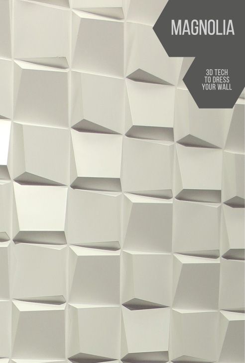
This piece is titled "Grid Large"—again, matching its sister post "Grid Small"— is both literally titled and the expansion of the original post. Although it is very strong, I believe this is my least favourite of the lot. Even "Ring" held up better than this. This is namely due to the base grid's panels being so close together, and yet every duplication of it has very apparent room in-between, especially on the sides, which would not be so much of a problem if there were gaps between every panel equal to that of the sides of grids of four. Outside of that annoyance, I believe this to also be the weakest due to the dull contrast; there is not a good balance of black and white—which causes an eyesore—and there is no clear direction when looking at it; my eye scans through it and does not take anything in, leaving no positive impression on me.

 Overall, this project was successful, and I have comfortably finished it. Throughout the span of five days, I've been photo-manipulating, analysing, researching and evaluating, when I easily could have had it done within about two days tops, but thanks to the magic of procrastination due to the need to be inside thanks to COVID-19, I managed to put it off to progress in video games, which in my ADHD-riddled mind, is totally more important than college work. Excuses aside, now that this project is finished, I will be on the lookout for the next task.

Pinterest Images


From the four images I mentioned in my first post, this was the first image that stood out to me as I was first browsing Pinterest for images such as this. Although these are in fact plastic wall panels and are not made from paper, they have a very similar appearance to folded paper, with the corners being rounded off and the texture being smooth and white.

 As for the lighting in this photograph, there appears to be a studio light coming in from the upper right-hand side of the image. The four tiles in a 2x2 grid from the top left-hand corner of the photo to the centre are repeated for each pattern afterward, as seen by the tiles in the top right-hand corner, the bottom left-hand corner, and the bottom right-hand corner, which are all the same as the tile in the top left-hand corner.

 The four tiles are unique, in that they are rotated in different directions but then are placed in a pattern. With small square cut-outs of paper, I will fold them all uniquely and have them in a pattern not too dissimilar to this. With Photoshop and other Adobe products now at my disposal, I will easily be able to adjust the base photo and create a more concise and cleaner pattern.

 Due to this image featuring plastic panels, it would obviously be a lot more difficult to recreate this with paper as making very precise folds can be difficult, as well as the fact that corner folds will overlap on paper without folding it in half diagonally, which would skew the look I am aiming to achieve. The final piece will look different to this, but I am hoping to achieve a similar pattern / similar shapes with this attempt.


Here is the second image I selected from my Pinterest board. This piece, too, is created from plastic, and has a smoother texture and brighter lighting than the previous. These shapes, however, appear easier to create out of paper as they feature folds through the middle of the tiles rather than exclusively on the outside.

 It may also be possible to construct these out of cut-out pieces of paper all stuck together to form a shape similar to this, although I do not want to bring too many materials and techniques into this project, as the main ideology is simplicity; minimalism and easy recreation is the lynchpin of this project.

 The lighting in this image appears to come almost from directly above, albeit further toward the back and to the right-hand side some more, say, in the top right-hand corner and higher above the tiles / in front of, seeing as these may be displayed on a wall in this demonstration. There is almost no clear or consistent pattern throughout, not in grids nor rows, although the bottom row does show a consistent pattern, with the upright panels' left-hand side face slanting downward toward the middle, and the sideways panels' middle fold tapering down into the right-hand middle and then back upward in both the first and second set. In layman's terms, left, down, up, left, down, up.

 For most other rows, however, there appears to be no pattern aside from the occasional 1, 2, 1, 2, 1, 1, as seen in both the third and fourth rows. Despite the inconsistency of the patterns, I will attempt to recreate these shapes and lay them out similar to the first image. I may also branch off into slightly different territories, i.e. ripped paper or simple folded structures to create effects, i.e. springs or circles.


Here is the third image I selected from my board. This may look familiar, as it is a demonstration of a full wall with the tiles of the first image on. Seeing this pattern in a larger scale and from a different angle gives me a better idea of how to recreate this, as some shapes just out very far and others taper inward at different angles, such as the bottom right-hand corner one out of the four in the middle.

 The folds are going to overlap due to the recreation being made in paper, but I am okay with that, as a perfect recreation is not what I am going for, but an effect not too dissimilar.

 In order to recreate this piece, I will take the original pattern from the first recreation, duplicate it until the canvas is filled up and change the perspective to be viewed from the left-hand side. Doing it this way as opposed to having it the other way round will make it much easier as I will not have to manually rotate, scale or warp any of the patterns.

 Due to the tiles in this piece having the same consistent pattern as in the first image, the consistency will remain as the pattern will be the same in both this recreation and the first. The first will simply act as a small scale, a demonstration with simple photo editing, whereas this will act as a test of abilities in Photoshop, what with the warping, scaling, light balancing, etc.


Here is the fourth and final image chosen from the twenty-odd on my Pinterest board. Dissimilar to the previous posts, this piece is actually created from white paper, with an engineer having transformed the standard sheets into warped tiles.

 Of course, the comparison between a college student's ability and the ability of an engineer with both several years and a wide range of experience is unfair, but I will still attempt to create something similar to this.

 Keep in mind that most of these recreations will differ greatly from the source material and may not be easily ascribed to the inspiration, although I will be attempting to recreate them partially to the best of my abilities.

 I am unsure as to what else I may be able to write about this piece as it is very similar to all the previous ones in that it is warped, carefully constructed paper panels on a wall. The main difference between this piece and the previous pieces is that this one is made from paper, whereas the others use a material with a colour and texture akin to paper.

Mentis Imperium, et Lunam, et Pastor

  The final stretch of my surreal photography project was not as ambitious as I had hoped, but on the brighter side I got to convey a differ...