Mentis Imperium, et Lunam, et Pastor

  The final stretch of my surreal photography project was not as ambitious as I had hoped, but on the brighter side I got to convey a different, more abstract story from Officium Parabolam in Et Luna, et Pastor. The entire project altogether feels a little mismatched, and this is mistakenly due to me working on these completely separately from one another. For future personal projects akin to this, I will work on both halves at once so they have continuity and consistency in their themes and quality.


 Despite this, I have created three unique illustrations on three photographs for the first half, and have photographed six different paper set constructions and adjusted them in Photoshop for the second half. Inspired by Officium Parabolam, the second half features a familiar setting, albeit less detailed. For the sake of making things interesting I retained the Latin titles, with Mentis Imperium meaning "mind control"—the main theme of "HIJACK" which inspired the hands/fingers triptych—and Et Luna, et Pastor meaning "the shepherd and the moon".


 There's a certain aura that the second half of this project gives me which I could only ascribe to one song; The Shepherd and the Moon by Aphrodite's Child. Music often helps me in producing my work by helping me slip into various emotions and re-contextualise my ideas and make something new out of them. If I worked on these pieces in complete silence and had no exterior influence past my chosen theme and artists, I fear my work would have been terribly bland and uninspired. The sheer power and force behind music and emotions helps drive me to push the quality of my work to a fuller degree, and I really feel that in this project, namely in the first half.


 Finally, here are the total nine images that conclude this project.


Finger Friends - The Handy-Dandy Triptych

 After about a month's gap between posts, I've created a third piece to create a triptych of hand / finger-themed pieces using mixed media of photography and digital illustration. These have been appropriately resized and cropped to print horizontally on an A3 sheet at 300dpi.


 This first piece was produced with the intent of introducing the theme in a very simplistic manner, using a few basic shades of grey off the bat. The hands feature no detail aside from the fingernails and the occasional crease. In later pieces, this was rectified and done to an almost uncanny and nauseating degree to hammer in the theme of unease and mystique. I also used elements of childlike wonder in using your fingers to act as little people on items such as your table or books, but to a much larger, absurder scale.


 This second piece is my personal favourite as I feel it perfectly encapsulates the feeling of absurdity and confusion I was going for. These "fingers-friends" all act independent of each other and are off doing their own things, i.e. one's stepping from one car to another, one's stepping from one chimney to another, one's sliding down a rooftop, &c.


 Finally, this third piece was created to fully push the theme of surrealism and chaos by having various forms of these "finger-friends" altogether, i.e. the large bug-antenna-eye-esque one in the sky, the regular ones on the roof and on the pavement, and the spider made of fingers crawling down the alley.

 To help tie these three images together, I used the aesthetic of the first image in the "finger-spider" by not detailing wrinkles or creases, but instead having just fingernails, as well as light and dark fingernails. Most of them have skin tones slightly darker than the tone of the fingernails to replicate that of human fingers, but I decided to vary it for another slightly level of absurdity.

 Next up, I will be constructing a series of photos using basic constructions made of paper and ink, as seen in my first post, Officium Parabolam. I will be taking a much more sophisticated and educated approach to this series of photos by making full use of the materials I have at home. I plan to use a variety of paper, from A3 card to thin, flimsy A4 lined notebook paper.

 The card will likely be used for the walls for stability, with the lined paper for details such as the floorboards or miniature pieces of paper. Wherever appropriate, I will add detail using ink or graphite, i.e. on the miniature papers, the doors, the floors, the walls or potentially the ceilings.

 For each "set", I will take a photo of the full set and document the process, i.e. setting it up, getting the lighting, creating illustrations for each piece, &c. I plan to use both natural and artificial lighting for this part of the project and utilise my bluetooth colour-changing lightbulb to create different tones for each picture. Wherever possible, too, I will use my phone's flashlight at varying levels of brightness fitting for each set, i.e. indoors, looking through a doorway to the outside world, &c.

 Overall, I'm pleased with how this part of the project has come out and I'm excited to introduce the second act and experiment with different sets.

Hands - Two Pieces

My final photography project involves combining photographic and illustrative methods to create surreal pieces. My chosen theme for these said surreal pieces are hands and fingers in abstract and lonesome environments that we don't pay much attention to. This is done to add an element of intrigue and mystery to these desolate locations.

 
This first piece is set in an alleyway leading into Causewayhead, with a row of houses on the left-hand side and an apartment complex on the other. Houses are less interesting to the human eye as they are so familiar to us, so I decided to add a flair of strange and otherworldly elements to them. I also found that it would be more interesting in terms of composition as the outline of the houses meant for greater possibilities of hand poses.


 This second piece was shot in the street adjacent to the alleyway of the previous piece, showcasing the row of houses that lay ahead of the previous row. This is due to the road beforehand splitting off into two, with the other route seen in the previous piece. I decided that because this was a denser, more populated area, I would add more of these hand-like creates in the form of two fingers.

 This idea came from the concept of using my index and middle fingers to act as human legs and walk around with them, a very abstract and whimsical, childlike idea which is implemented beautifully into this piece. To better vary the tones of the image, I used both light and dark skin tones on the hands, with lighter tones on the fingernails and no shading to provide a more otherworldly and abstract look. This also helps them stand out from the piece more.

 If I had the talent and ability, I would have digitally painted these on top to make them seem as though they were real. For now, that is a mere concept, but I am more than happy with how this piece turned out. The third piece will feature a similar idea, likely combining the previous two, in an even more abstract and open location.

Photography Plan

The plan for my photography course involves working harder in the appropriate environment for me to produce pieces in my chosen theme. Working at home has tanked my inspiration, creativity and motivation for this course as I feel less driven to work among my distractions and other hobbies and occupations. Working alongside other students grants me the will to work in the first place as the surroundings both call for and are better fit for it.


 First, I will be catching up on my current project by producing sketches on top of my chosen photographs before moving on to full digital illustrations alongside annotated screenshots. These pieces will be in the same vein as one of my previous pieces; drawings of giant hands / monsters / creatures atop my photos. These chosen photos are of houses and streets that we often pay little attention to when we walk through or past them. My goal with this project is to add a flair of mystery to these lonesome and plain spaces.


 I have created a small to-do list for when I come back, and it goes as follows:

  • Create sketches for future pieces
  • Work out colour palettes for pieces
  • Do lineart and colours fully per piece
  • Take screenshots and document progress
  • Collate into collage Duane Michaels-esque

 One of my lecturers has also created a helpful, detailed page regarding my plan coming back into college.

More Duane Michaels

I have taken various photos of mundane and lacklustre areas which we don't often pay attention to whilst passing through; areas that are unfamiliar to us or that have no quality that fascinate or capture us. For example, my back garden, the coombe to the roundabout, the laneway into town. These are examples of areas we may pass by or co-exist around but do not pay much mind to because they are bland and only act as dead ends or merely paths from point A to point B.


 I started with my back garden using my small point-and-shoot camera and took photos around the garden. This first photo is in the same location as seen in "HIJACK", albeit not pointed upwards.


 I then moved on to the path toward my back garden's gate and took a photo looking down that path. I really love the shapes in this image, i.e. the side of my house on the left—almost framing the image—the house behind the fence, the poles, wooden poles and the wheelie bin stretching up from the ground.

 These shapes are blocky, chunky and simple and breed more life into the complex and detailed environment, i.e. the plants at the back, the decorations on the wall, the little pebbles and rocks in the back and the fancy wooden fence.


 I then moved further outside up the path towards my college campus and took photos around the street. This was the one that stood out to me compositionally, although it's unfortunately a very low quality due to the camera I used and it being shot quickly in a passing walk.


 These photos were taken another day on my phone which, whilst often lower in resolution than the highest settings of my point-and-shoot camera, captured light a lot better and came out a lot sharper, especially after editing them in Photopea.


 Another area that I often pass through but never pay much mind to is this laneway into Causeway Head. A row of old houses sit on the left-hand side behind cobbled walls along a pathed pathway adjacent to a large apartment complex.

 Not that visually stimulating after a while, and passing through it often just makes it a slog to walk through. Aesthetically, this is a very unique area, as the photo below helps demonstrate.


 This last photo was taken on the street on the other side of the cobble walls seen in the previous photo. As the street begins with a fork in the road, I took a right to take said previous photo, whereas this photo was taken on the left side. This street is chock full of modelled houses with bay windows, rows of chimneys and organised front gardens.

 Whilst this area is also aesthetically pleasant, it feels more lifeless to walk through. All the houses look identical in shape and colour, all with their curtains and nets drawn. These houses all stand proudly next to one another like they're going to war, but with them looking so identical, it's hard to get a sense of life or character out of them. I will attempt to incorporate this empty, cold feeling into my illustrative elements within this project wherever appropriate.

RUDY - Second Piece Screenshots

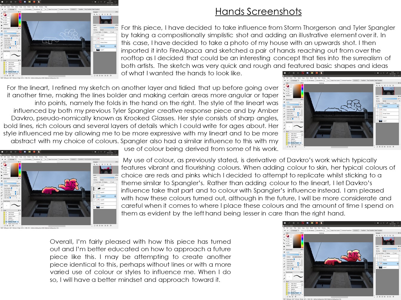
 Unfortunately, I worked under the impression that I had saved this piece as an image file and would be able to include it here. Due to this impression, I took screenshots of my work, imported them into PowerPoint, annotated them and saved them as JPG files. The actual .MPD file containing my illustrative work has not been saved. I ended up deleting the .MPD file as I assume it had been saved somewhere, yet I went to look for it today—January 8th, 2021and came up empty handed. I searched my entire drive and my OneDrive folders for the final piece but to no avail.


 Without redrawing the entire piece from scratch, I'm afraid that it is lost to time. The only remains of it are these annotated screenshots. As compensation for this loss, I will have to create the next two pieces of a remarkably higher quality. I have already created the template for the second piece which I will have to remake now as well as make a start on the third piece. My original intent was to have three pieces, but it will likely only be two at this rate.


HIJACK - First Piece


For my first piece, I have selected one photograph from my previous shoot and have created an illustrative atop it before making fine-tune adjustments in Photoshop such as exposure, saturation and cropping. Screenshots and further explanations of the process and of my thoughts are detailed below.


Duane Michaels Creative Responses

 Two weeks ago, I conducted a small photo-shoot around my house and have produced three creative responses to Duane Michaels which all have varying themes.

 This first set consists of shots of my home street with power lines in view to convey the literal connection between the images—power lines connect from post to post to transmit bulk electricity from substations across the grid. I hadn't realised that these photos would all work so well together 'til I had looked at them altogether in the folder that these photos were stored in.

 As I scrolled through them, thinking of what to do with them, I noticed this pattern. There were two other images that would have fit the bill, although they would have stuck out like sore thumbs and would break this rule of six images I am applying for this creative response. That, and there weren't many fascinating or unique qualities about the images themselves to begin with.

 This second set consists of photos—despite the first—of the branches of my willow tree in my front garden, all taken from different angles. I chose to take these images in ways in which it could almost be pieced together like a puzzle, but not quite. The complexity of a willow tree is hard to put together in bits and pieces, and its beauty comes from its complex and chaotic nature.

 I also chose to take a different compositional approach to this series by having parts of the tree dangling before the lens and others acting as an outline to the image, namely in the second, fifth and sixth images—reading left to right from top to bottom. If I were to arrange them to form an image close to what it could actually look like, I would remove the first photo, put the fourth at the top in the centre, then have the second below and to the left, then the third image next to that, before having the sixth image beneath the second and finally the fifth image below the third.

 Finally, I have a shoot containing animals. The first two and the fourth are of my kitten Rudy, sitting at a few months over a year old, the fifth is of my eldest cat Patches, sitting around eight years old, and the sixth is of my dog Priscilla, around the same age as Patches. As I usually muck about with my photo-shoots, I decided to snap quick photos of them and go about my business back to my shooting, although I found that these images work quite well together, so I decided to make them their own series.


 The third image is a grim and disturbing photo, it being of the carcase of a mouse my kitten Rudy had presumably killed. I rediscovered the carcase recently and it has since lost all solid form. I decided that it would make for a good image in this series to convey that whilst these animals are domesticated and friendly, they still have hunting abilities and are still capable of murder.

Tyler Spangler Creative Response [TABLET EDITION]


 For my second creative response, I have revisited Tyler Spangler's style and have recreated my original response piece to be a lot more eccentric and colourful as is Spangler's work. I have taken personal artistic liberties so accentuate features and use more vibrant, sharp and contrasting colours as well as being more messy and rushed as to produce a grimier result which I am very pleased with.


 To produce this, I took the original PSD file, imported it into FireAlpaca on my tablet, created a new palette with different colours from the original piece, began with lineart, went over it again to refine it, moved to flat colours, then moved to the details. After the details, I recoloured them from a dark crimson reddish purple to bright turquoise to contrast the hot pink rather than transition from it into shading. I then selected dark blue for the shadows and bright yellow for the highlights which I added frantically and sporadically where I saw it, namely creating brush strokes in abstract places.


 I finished it off by drawing a rough outline of my cutout in the background with hot pink, then another quicker and messier outline in yellow before doing one more in dark blue. I finally added the turquoise background, erased some of my edges quickly for an added rough and gritty effect, and finally exported it as it is now. I am very proud of my work here and I feel this is a great step forward to what I really want to create.


 I've learned that I don't have to be precise and to always take my time in order to produce beautiful work, rather I have to have the will and compassion. Often times a time limit allows for a more beautiful expression of work as you don't have the time to think of a filter that'll limit it to what your audience wants to see, rather you're making it with only yourself in mind.

Dela Deso Creative Response [TABLET EDITION]


 After a few weeks of waiting, getting an email about my order being cancelled, a few more days of waiting, re-ordering and then another few days, I finally have my tablet. I actually received it proper back on the fourth of November but was unable to come in to photography 'til now due to headaches, nausea and oversleeping.

 Finally, however, I've been able to come in and produce work. The first piece I have created is a simpler, refined version of my previous Dela Deso recreation. In this case, I used FireAlpaca and used custom brushes for both the lineart and the colouring in. I used several layers for the colours, including a template colour, then a colour mask—this being the yellow & orange in the eyes, the periwinkle & purple in the skin and the light magenta & crimson red makeup. The eye itself is comprised of four colours layered atop one another in a decreasing size to replicate the layers of an eye—iris and pupil. In this case, the iris is three shades of blue that get lighter as they reach the middle, with the pupil being hot pink to conflict with the blues.

 The lineart was initially done in medium gray to stand out from the black and white background, then once it was finished, I enabled alpha lock and coloured it in black before continuing to the colouring. As with before, I based my use of colours on a clown rendition illustration of myself.

 Overall, I am happy with how this turned out and am excited to see how my Spangler and Kent recreations will turn out.

Mood Boards


 This mood board consists of the artists who I am basing my work upon. Seen above is the work of Storm Thorgerson, Duane Michaels, Gregory Crewdson, Richie Valezquez, Tyler Spangler and Sister Corita Kent. I have attempted recreations of all six of these artists and am pleased with most of the recreations and will be making further attempts once I have my tablet. This may allow me to produce more work of a higher quality and be able to replicate their styles better.


 Seen above is a mood board consisting of my own work inspired by the aforementioned six artists. Some have only one piece whereas others have several pieces. I am pleased with how most of these turned out and am excited to take these ideas further, namely the environmental photography stuff. The Thorgerson, Michaels and Crewdson recreations could be a lot better if I spent more time on them. 

 Once I have my new tablet, which—once re-ordered on the 29th of this month due to the original order being cancelled—should arrive around the 31st of this month or the 1st of November, I will be able to set it up, bring it into college and work further on these pieces with more attention to detail, more time to make further adjustments and tweaks and more precision especially regarding the graphic design elements, this being the Valezquez, Spangler and Kent recreations.

 The Kent recreations are from my graphics course and were not created specifically for photography, although I plan to print those pieces out—or to create them entirely traditionally—and photograph myself alongside them, much like how many of Kent's photos include her stood next to her own work.

Spangler Recreation

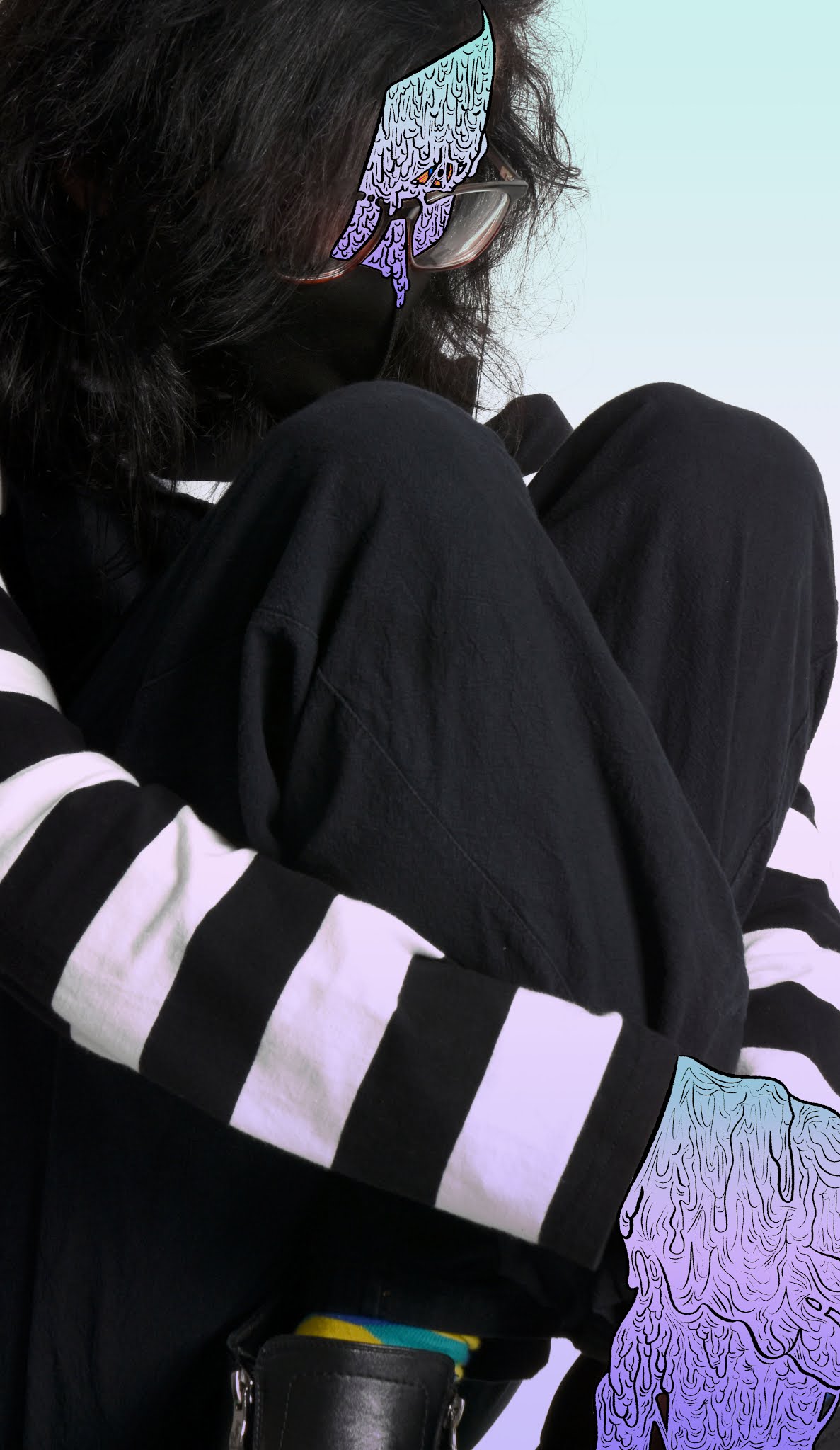
In order to recreate Tyler Spangler's work, I looked at various pieces of his and combined certain ideas, i.e. chromatic aberration, a black and white background image and a cartoony drawn element atop it, this being a photo of my hand drawn over with a cartoonist brush and filled in with various purples, with darker tones for shadows and lighter tones for highlights.


 I finished off the standard flat purple colour with a soft gradient to add a slight shadow to it due to it being a part of my art style. I also added custom chromatic aberration behind a rough cutout of myself as I saw that being a theme in Spangler's work, although may not have had enough time in this session to fully explore the idea and execute it properly, although it is only a minor detail here and thankfully does not distract from the main illustrative element.


 I am happy with how this piece turned out as I created it on a whim and was originally only planning to create another Dela Deso recreation, yet decided to tackle Tyler Spangler instead to see what I was capable of, and I am proud of what I have achieved. To improve in the future, I plan to use a less detailed, thicker brush, more vibrant and thematic colours, i.e. red, yellow and blue, and to add more detail and focus more on the background photo as well as the foreground elements.


Deso Recreation

Using my old graphics tablet and Photoshop, I was able to produce this recreation of Deso's work and am pleased with how it turned out. Previously, I had used a sharpie, paper and a scanner before deciding the lines were too thick, there was too little detail and the lineart itself distracted from the main piece. The layers for the sharpie lineart and respective colour placeholders remain in the Photoshop file, so I may go back, finish those up and document those at some point to show my progression.


 As for the colours themselves, I chose a nice soothing gradient from Photoshop's sample gradients, namely one that started off light at the top and changed both tone and hue as it went down. The eye colours I chose are in reference to one way I drew myself with yellow sclerae with pink blood vessels, dark blue irises increasing in tone as it drew toward the pupil, and, albeit not in this piece, bright pink pupils with an added shine overall. Of course, in this more realistic piece, I did not include that cartoony aspect, although it would be interesting to explore for the other lineart set.


Recreations

My current photography project has similar themes from various different artists and I am excited and inspired to look into them further by recreating their works. One of my first shoots was a recreation of the work of Duane Michaels by taking a series of photos in which a scene gradually changes via the introduction of more props, in this case, various sketchbooks, booklets, office supplies and sheets of paper. These photos were taken in my bedroom using my ceiling light as the lighting. The first photo was taken a while before the rest, so the lighting varies marginally.


This second piece took inspiration from Storm Thorgerson's work; in some of his photos, most of the sky is visible with the ground at the very bottom, or a dichotomy of land and sky. Essentially, there is a balance or imbalance of the ground and the sky which I attempted to emulate in this piece. By photographing my willow tree and having the rest of the image be the night sky, the light and dark contrast is high.

 Composition-wise, this shot was very easy to produce and only took one step—sit on the ground looking up. By sitting in my front doorway and pointing the camera upwards, maybe 45 degrees upwards, and aligning elements of the willow tree with the edges of the screen, I snapped this photo. It wasn't until after I took the photo that I noticed a streetlamp's light peering through in the background, which I found to be a nice addition, giving it a more warm, less sinister vibe.


 These next few pieces were inspired by Gregory Crewdson, whose work appears to look straight out of a movie, with characters sat or stood still in candid wide-shots of unsettling environments with an elegiac aura. Whether it's the models themselves, the environments, the tone of the image or the composition, there is always a perturbing element within Crewdson's work.


 The first piece, I took laying on my bed with my legs outstretched. I took inspiration for the composition from Thorgerson, with the balance of the bed and the curtains with a figure in the middle, although tone and colour-wise, it is Crewdson-inspired. The slight glare of the light outside seen through the curtains seems to disturb the flow of the image and distract from the center focal point, although I won't let that ruin it all for me. The lighting is simply the harsh glow of my television and computer monitor on which I had the same imagery to make the lighting fair.

 The aura of the image evokes a disturbed and attempted relaxation session whilst something is wrong in the figure's mind. The unsettled positioning of the legs, the cold lighting, the darkness across from the bed reflecting the uncertainty, and perhaps the light outside being the lingering thought or the wrong in the world that bothers them.


 The imagery on the screens across from my bed were that of the cover for the album April Fools by The Scary Jokes. I chose to listen to this album as I took this series of photos in order to help influence the vibe I was hoping these images would give off. The album itself has been described as "the best sad clown music", which is akin to what feeling I was hoping to portray in these images.

 The two smaller screens are that of my Nintendo Switch Lite and my iPhone, on which I was playing the same video. On all screens, the brightness was turned up all the way, although the sound was only playing on my television, as that would have produced the most noise. To me, this image represents addiction and obsession with a specific idea or topic which applies to myself. The album and the artist behind it are very fascinating to me and I have an odd addiction to their work, so I portrayed that addiction through this piece.


 I took this photo after applying a random setting to the DSLR camera I was borrowing at the time, which turned out to be surprisingly good. The rich, vibrant blues and purples contrasting with the oranges and yellows struck me. The lighting was produced with near similar properties to that of the previous image, with only the television screen producing the harsh light. Overall, this series of images was very fun to produce, and with further adjustments, I could see the latter two fitting into the Crewdson aesthetic, i.e. further-distanced shots, different lighting, different camera settings, further Photoshop adjustments, et cetera. However, I am happy with it as it is.


 In my graphic design course, I have produced two pieces in the style of Sister Corita Kent's work, whom I mentioned in my previous post and whom I plan to recreate for this project, too. The process will be slightly different, however. First, I plan to construct the piece as usual, with paper, a craft knife, glue and a scanner, before compiling it in Photoshop. Then, I will have the piece printed in A3, trimmed down, stuck onto a wall and then photographed with a figure alongside it. Many photos of Kent feature her and her works, so I supposed this would be an ideal addition, seeing as the theme of her work itself is fairly surreal and abstract. If it can be psychedelic, it can be surreal. I may also use the aforementioned process but attempt to create it all traditionally and then photographing it.

 I plan to execute my ideas for Spangler recreations when I have my graphics tablet, and I will also be able to further develop my Kent recreations. On top of that, I will be able to appropriately create Valezquez-inspired pieces as I can add and take away as much detail as I please and experiment with colour in a very wide variety. By using the tablet as opposed to a printed image, a lightbox and a sharpie, I can make immediate changes to parts of the raw image file rather than having to go through a long process several times with large room for errors.

 The rest of the images here are the other photos I took.


Mentis Imperium, et Lunam, et Pastor

  The final stretch of my surreal photography project was not as ambitious as I had hoped, but on the brighter side I got to convey a differ...